
Purple Avocado Fitness
Empowering users to be healthier by designing a fitness tracker application which can be linked to a wearable device.
Role
User Design, Prototyping, Field Research, Usability Testing
Team
Noverah Khan, Maham Ghazanfar, Atharva, DianDian
Tools
Figma, Miro, Slack
Timeline
3 Weeks
Background
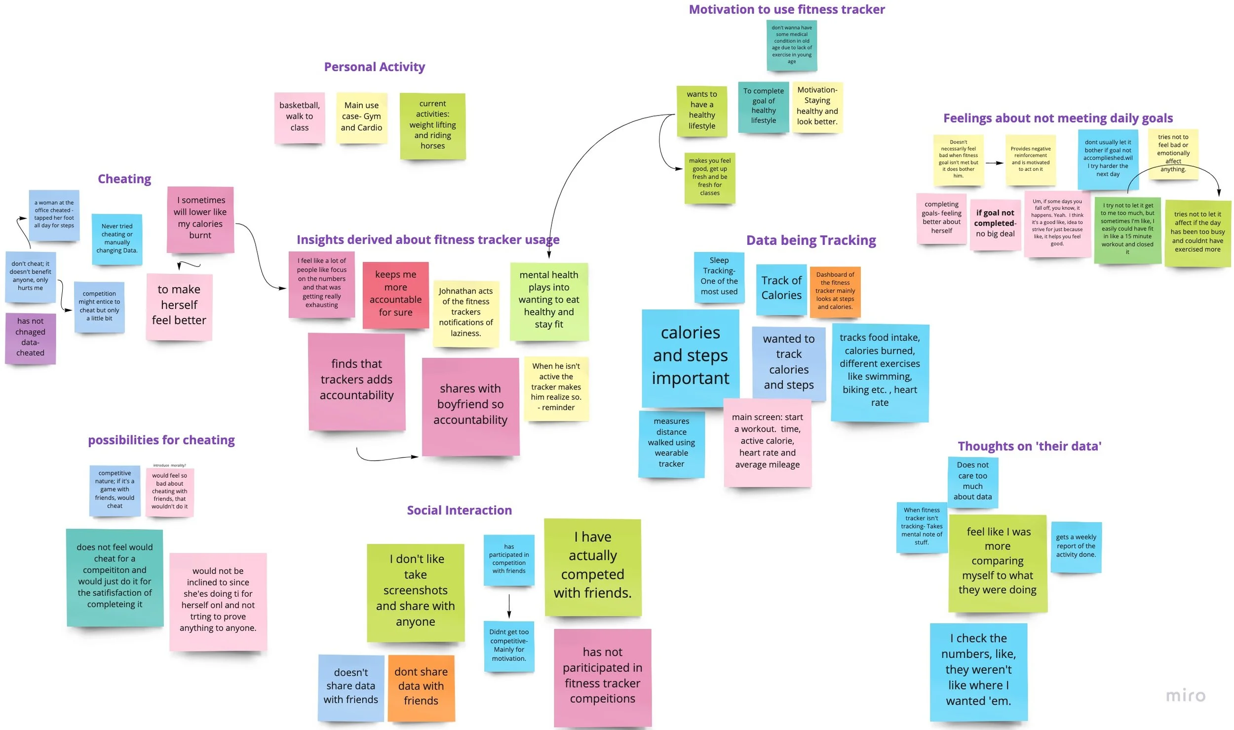
Fitness trackers keep a record of a user’s activity and provide the data in the form of visual representations in order to motivate the user to achieve and maintain a healthy lifestyle. However, there are questions regarding the effectiveness of fitness trackers as users sometimes cheat the system to obtain desired results. Team Purple Avocado Fitness explores why users feel the need to “fake out” and how they could be intrinsically motivated and empowered to not do so.
Research
Our secondary research was focused on the following points:
Reasons people cheat
Motivation for using fitness trackers
Emotional and psychological effects of using fitness trackers
We then analyzed existing mental health applications to see which elements of this category of applications make users feel comfortable about themselves and cater to their mental well-being, since we wanted to focus on how effects on mental health could contribute to faking fitness tracker data. We also analyzed commonly used fitness applications to see what features currently exist and how the interface design affects people’s mental states.
For our primary research, we conducted semi-structured interviews with 4 undergraduate students in the US (2 males, 2 females) aged 19-21 who use a fitness trackers and regularly engage in a physical activity. We created an Affinity Diagram to organize the insights from our interviews.
Prototyping
After having a brainstorming session about possible solutions to the ‘fake out’ problem, we decided to sketch out our ideas and discuss them.

Based on the sketches, we identified the ideas presented and selected the ones we thought would be applicable for our application before moving on to wireframing.
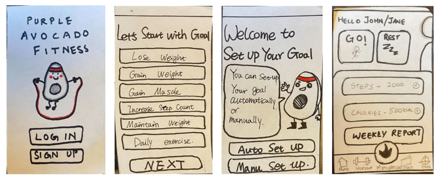
Screen 4: Application Home Screen
Screens 1, 2 & 3: Onboarding flow of the application
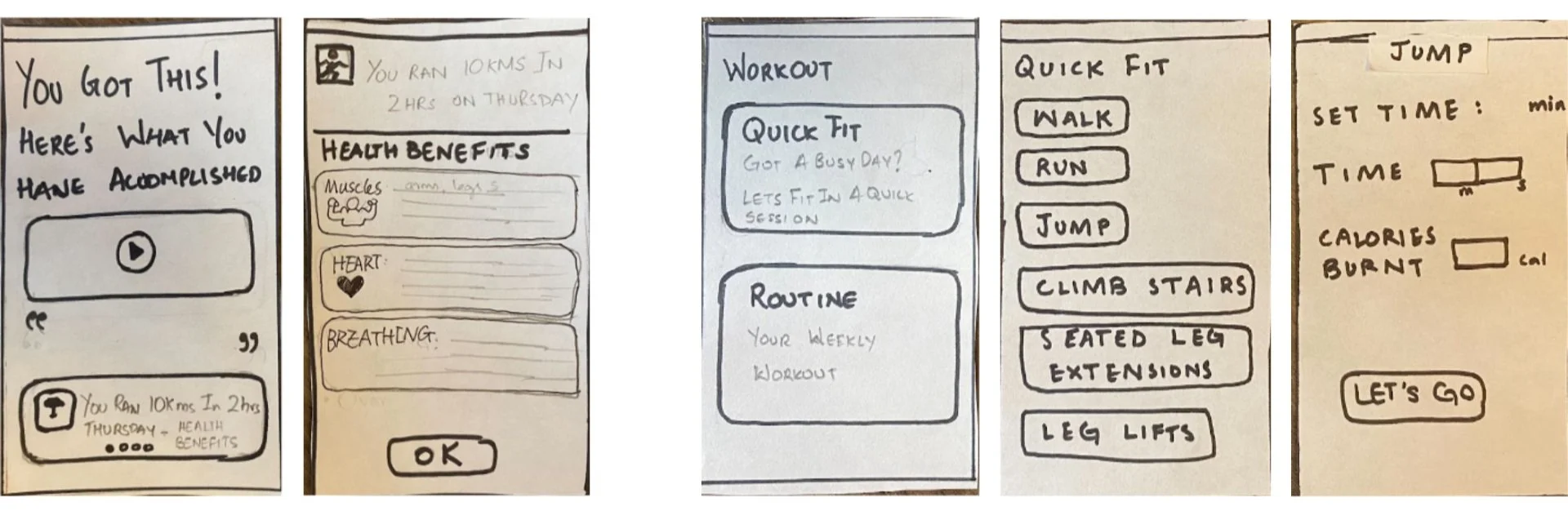

Screens 7, 8 & 9: Workout
Screens 5 & 6: Motivation
Screens 11 & 12: Weekly Report & Goal Settings
Screen 10: Rest Day
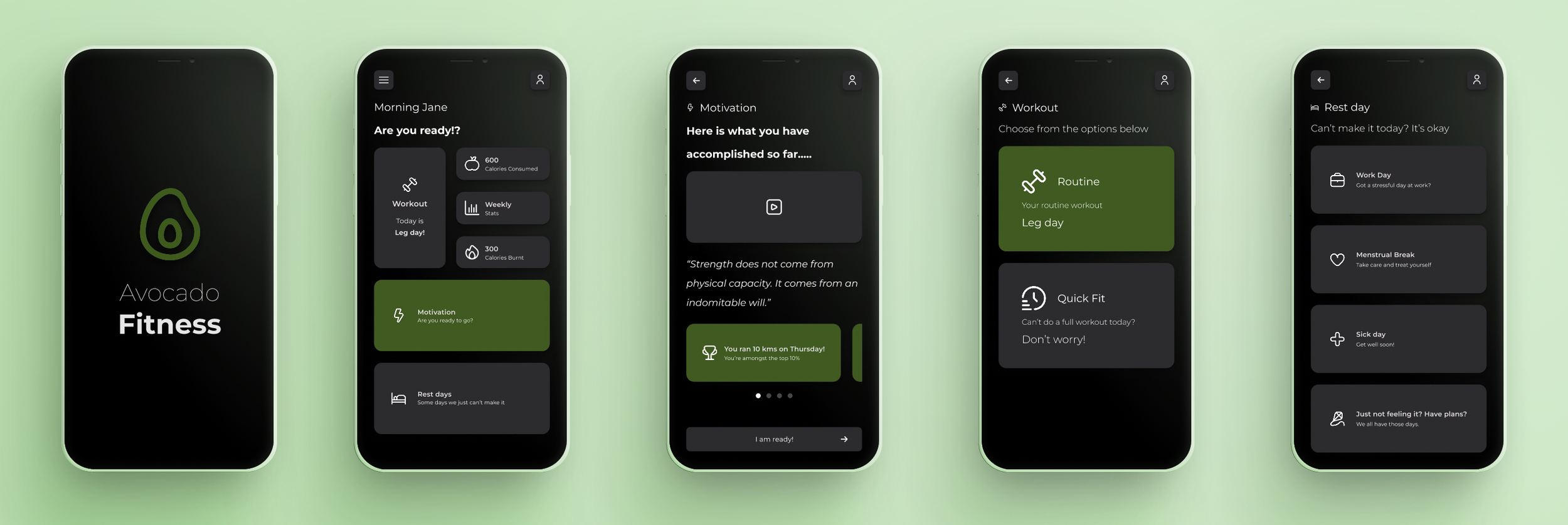
Final Prototypes
After wireframing, we created high fidelity mockups through Figma.
Testing
Finally, we conducted 3 usability tests (with a pre-test questionnaire, 5 task flows and a post-test questionnaire). We got the following insights from the tests:
Participants weren’t able to accurately determine what the “GO” button was for. User 2 thought that “GO” meant action so she selected it for motivation instead of clicking the “Motivation” button.
Both users mentioned that the “GO” and the “Motivation” buttons should be switched so that the “Motivation” button is next to the “Rest” button (as they both are secondary features) and “GO” is the bottom circular button (as it’s a primary feature).
The “Choosing Goal” option for initial setup was a bit vague and confusing because both “Weekly” and “Daily” goal options were present.
The users were unsure if all the “Set Your Own Goal” options (steps, calories, distance and workout time) had to be selected (and set) or if the users could choose to set one or two of their choice.
Redesign
In accordance with the testing insights, we redesigned the application home screen (changing a couple of signifiers and switching the positions of the ‘Motivation’ and the ‘Go’ buttons). For the Daily/Weekly Goals, we replaced the button in the selection section with the toggle button, so that users can more clearly realize that not all options must be selected.

Screen 1: Application Home Screen
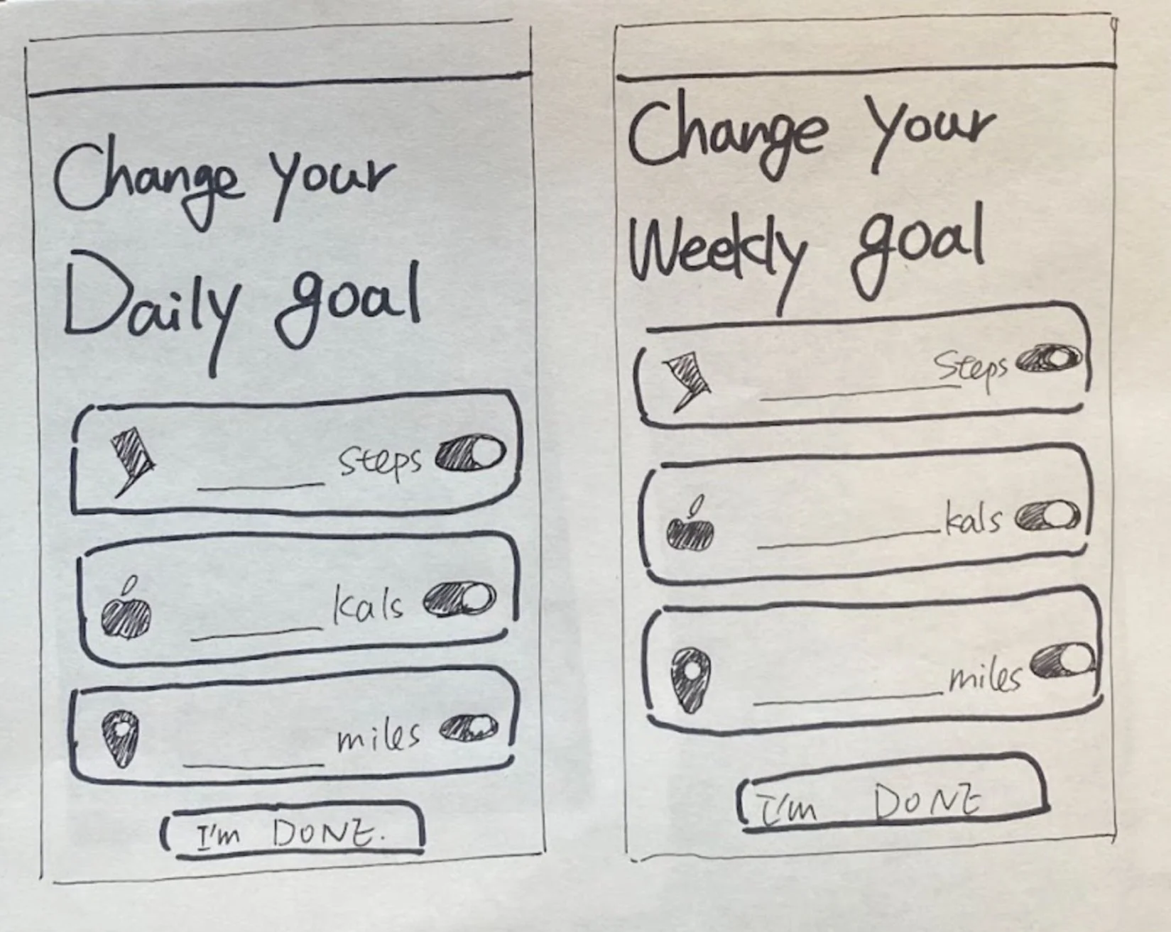
Screens 2 & 3: Daily/Weekly Goals